Quentinjaquier · CA
Vol. I — Montréal FR / EN
§ 04 — Portfolio

A small portfolio of dashboard work

Dashboards built to demonstrate how I think about reporting craft. The data is fabricated; the data model, the DAX, and the dashboard structure are not. Synthetic data, modeled on the output patterns of a project simulation engine.

i.

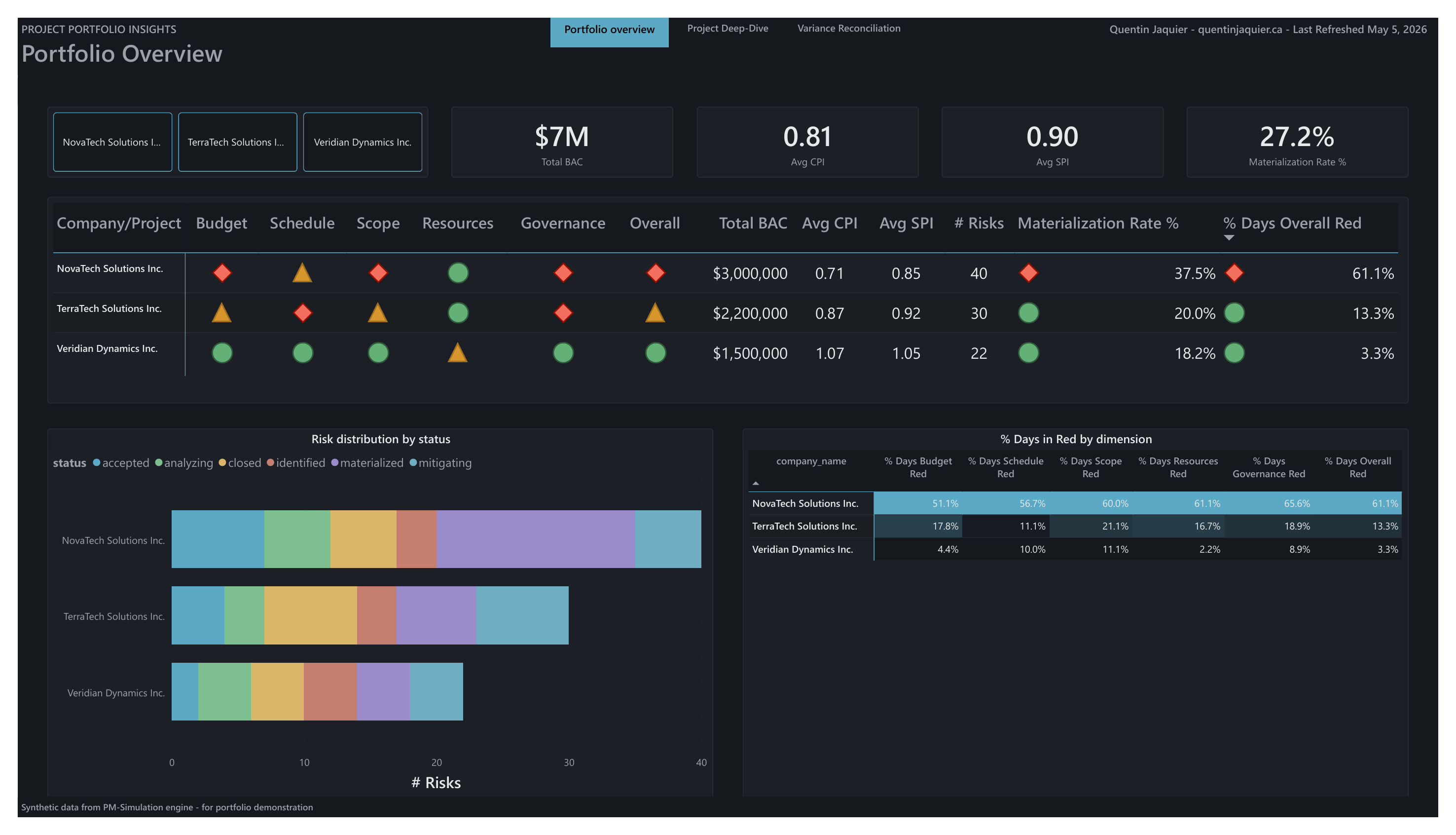
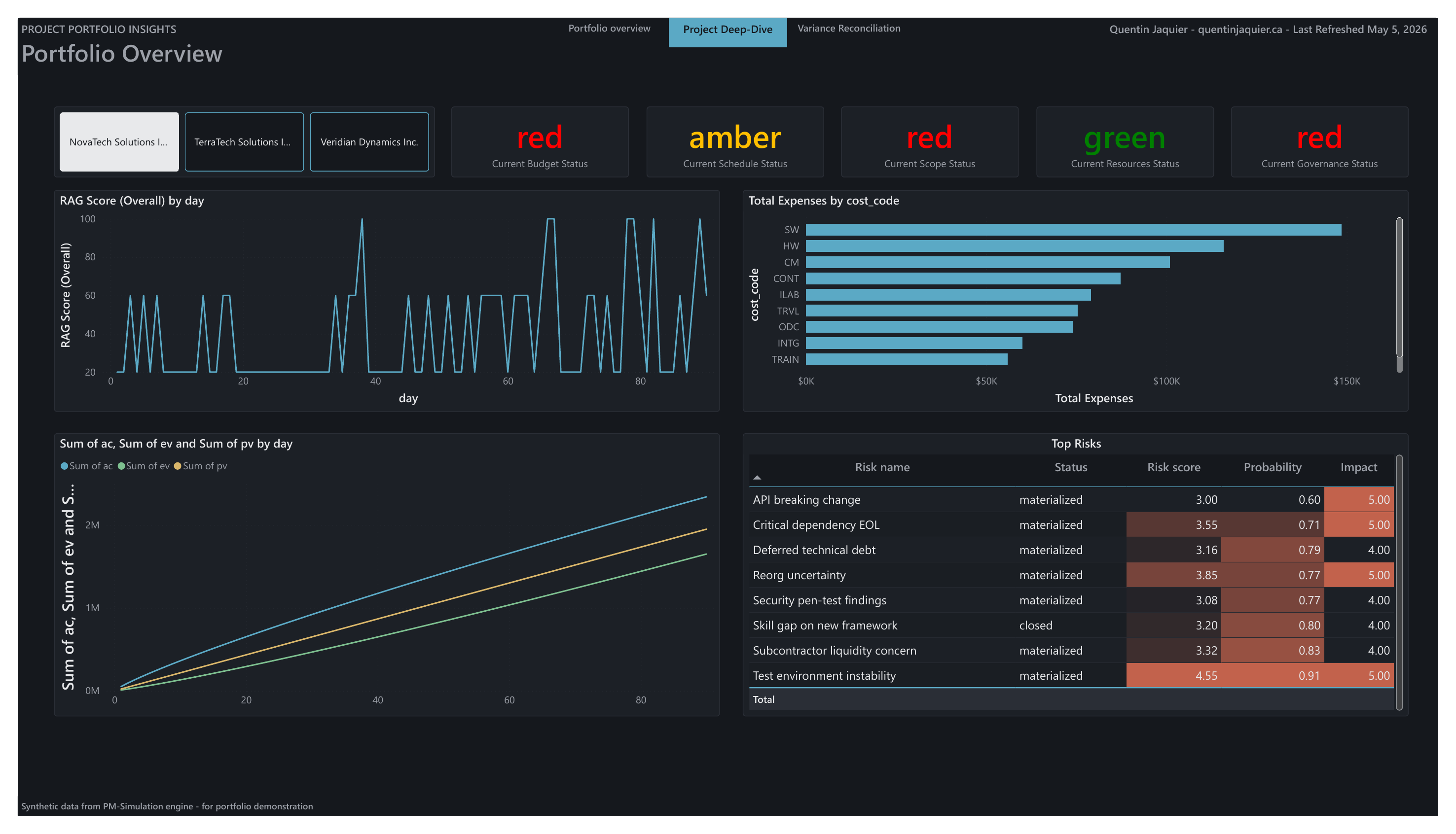
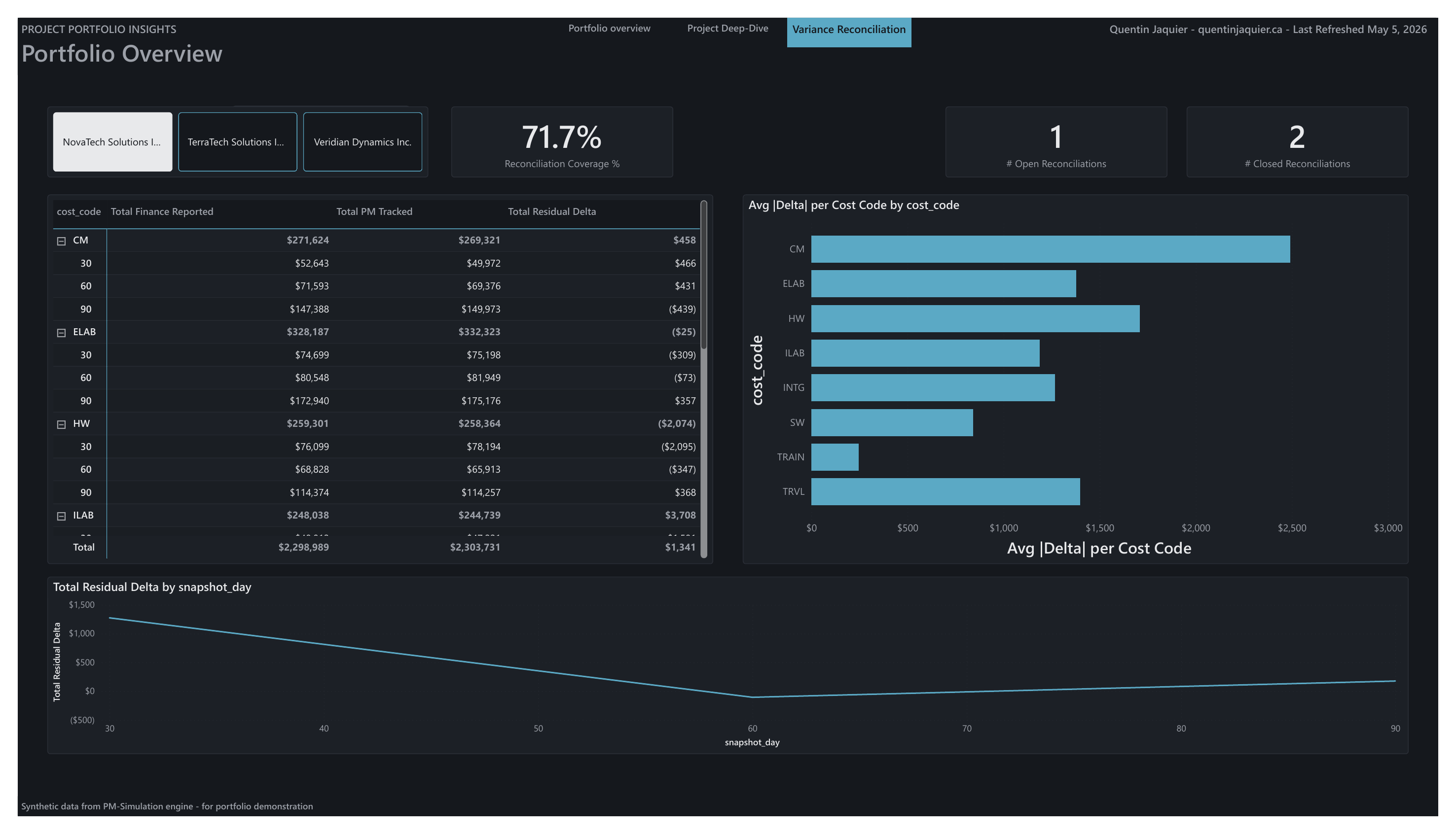
Project Portfolio Insights

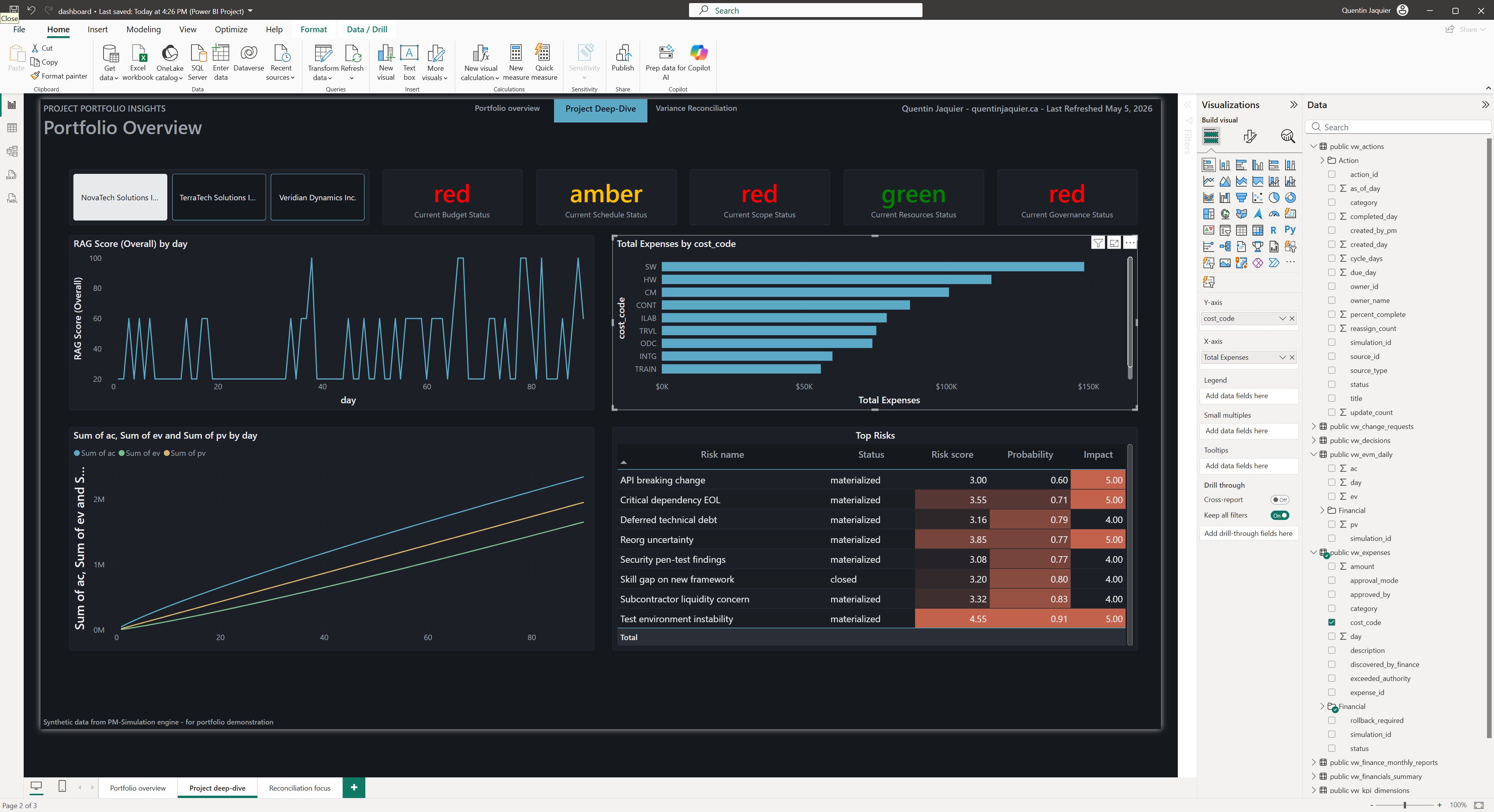
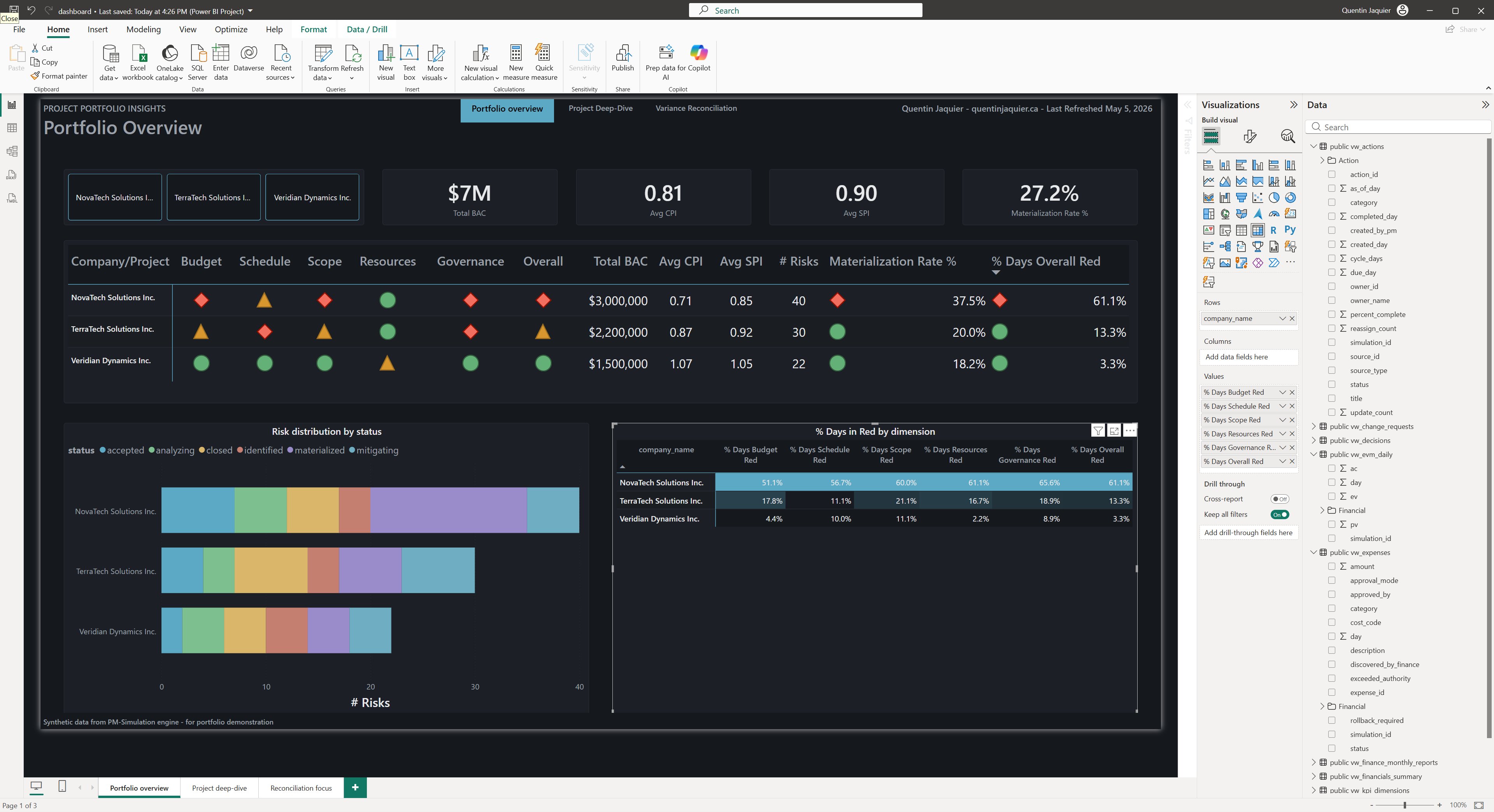
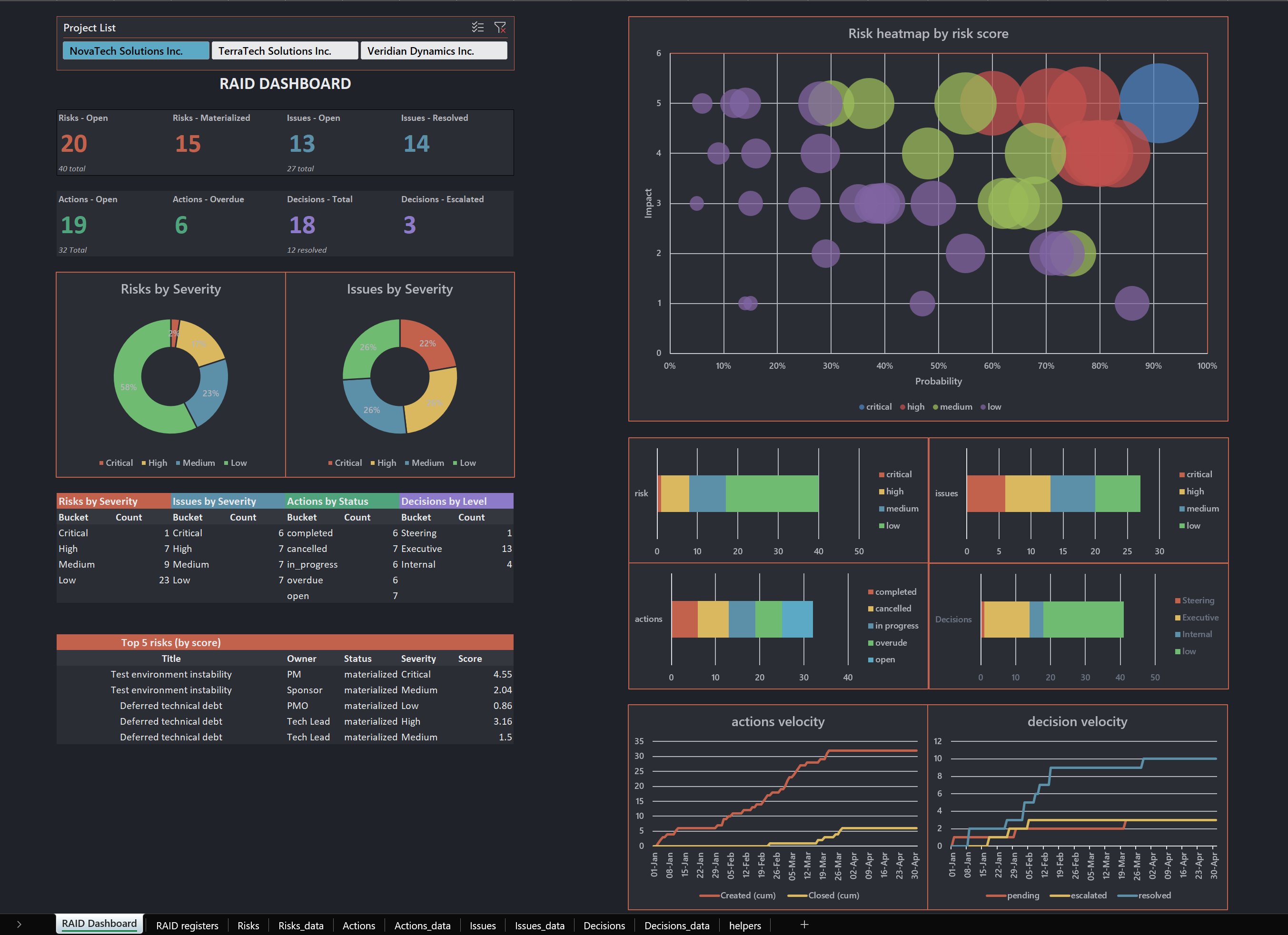
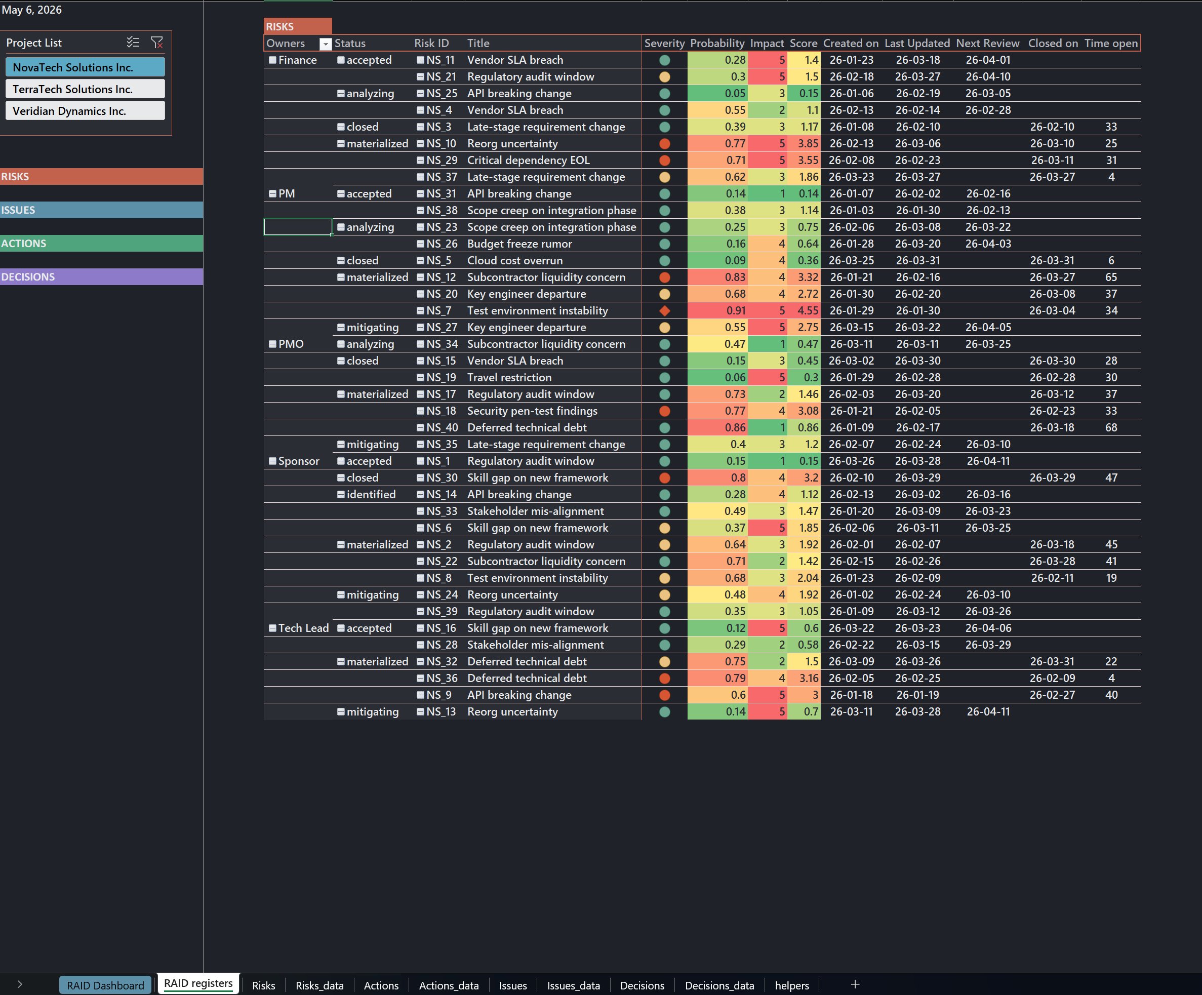
Three coordinated views of a fictional portfolio: Portfolio Overview (executive RAG matrix across budget, schedule, scope, resources, governance), Project Deep-Dive (RAG history, EVM tracking, risk register, cost breakdown), and Variance Reconciliation (residual delta between finance-reported and PM-tracked actuals, by cost code and over time).

Most RAG dashboards show current state. The matrix on page one shows % Days Red by dimension, how often each program was red over the period, not just where it sits today. That column catches programs flickering between green and red on snapshots while operationally chaotic underneath.

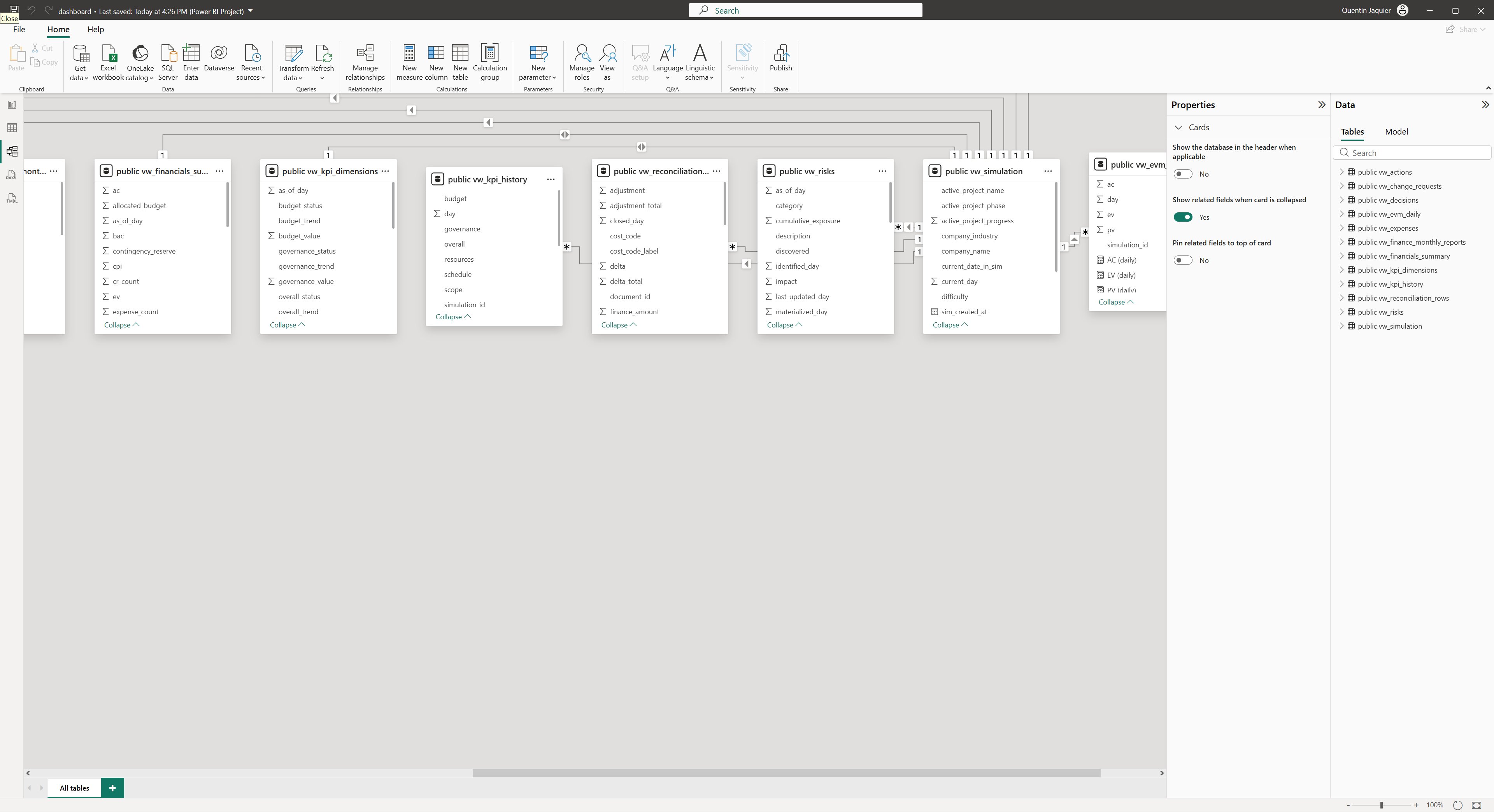
Built on a star-schema data model with 13 views and custom DAX measures. Three project profiles (red, amber, green) staged to make the matrix readable as a story rather than a table.

Power BI — Portfolio Overview page, RAG matrix across the three companies with % Days Red column
Page 1 — Portfolio Overview
Power BI — Project Deep-Dive page, RAG history, EVM tracking, top risks and cost breakdown
Page 2 — Project Deep-Dive
Power BI — Variance Reconciliation page, residual delta by cost code and over time
Page 3 — Variance Reconciliation
Behind the build
Power BI Desktop — star-schema data model view with 13 views and their relationships
Data model — 13 views, star schema
Power BI Desktop — Portfolio Overview canvas with the % Days Red measures panel
Portfolio Overview canvas — DAX measures
Power BI Desktop — Project Deep-Dive canvas with visualizations under construction
Project Deep-Dive canvas — visual construction
ii.

RAID Dashboard

A PMO-operations companion to the Power BI views, serving the same data to a different reader. The Power BI is built for executives reviewing portfolio health at a glance. This one is built for the PMO analyst who needs the four registers (Risks, Issues, Actions, Decisions) on a single slicer-driven worksheet.

KPI tiles, severity distribution donuts, a probability-vs-impact heatmap with risk-score-weighted bubbles, and cumulative-flow charts for action and decision velocity. The Top 5 risks pull from the live register. Project slicer at the top filters everything in one click.

The full workbook is downloadable below, with eight backing sheets behind the dashboard.

Excel — RAID Dashboard sheet, KPI tiles, severity donuts, risk heatmap and velocity charts
RAID Dashboard sheet
Demo — project slicer filtering the entire dashboard
Excel — RAID registers sheet, risk register with severity, probability, impact and time open
RAID Registers sheet
Demo — navigation between RAID registers
Download
raid-portfolio.xlsx
Microsoft Excel  ·  8 backing sheets